Team Project (tP):
Week 10 [Fri, Oct 16th] - Tutorial
1 Demonstrate an assertion failure
- Demonstrate an assertion failure using Intellij.
- Modify the code of your tP to deliberately cause an assertion failure
e.g., addassert false;somewhere in your code. - Run the code so that the application crashes with an assertion failure.
- Take a screenshot and paste in the tutorial workspace document.
2 Give examples of defensive programming
- Give an example of defensive programming from AB3 or your tP.
3 Review the Developer GuideDG of a Peer Team
- Evaluate the sample DG extracts (will be provided by the tutor), as guided by the tutor.
- In particular, detect the following DG bugs (they are the same bugs that will be used when evaluating your final DG).
Admin tP Grading → DG Bugs → Architecture Section → Possible Bugs
Architecture:
- Symbols used are not intuitive
- Indiscriminate use of double-headed arrows
- e.g., the sequence diagram showing interactions between main componentsarchitecture-level diagrams contain lower-level details
- Description given are not sufficiently high-level
Admin tP Grading → DG Bugs → UML Diagrams → Possible Bugs
UML diagrams:
- Notation incorrect or not compliant with the notation covered in the module.
- Some other type of diagram used when a UML diagram would have worked just as well.
- The diagram used is not suitable for the purpose it is used.
- The diagram is too complicated.
Admin tP Grading → General Documentation Bugs
Use of visuals
- Not enough visuals e.g., screenshots/diagrams
- The visuals are not well integrated to the explanation
- The visuals are unnecessarily repetitive e.g., same visual repeated with minor changes
Use of examples:
- Not enough or too many examples e.g., sample inputs/outputs
Explanations:
- The explanation is too brief or unnecessarily long.
- The information is hard to understand for the target audience. e.g., using terms the reader might not know
Neatness/correctness:
- looks messy
- not well-formatted
- broken links, other inaccuracies, typos, etc.
- hard to read/understand
- unnecessary repetitions (i.e., hard to see what's similar and what's different)
- Also, lookout for places where these tips can be applied.
Admin tP: Deliverables → DG → Tips
- Aim to showcase your documentation skills. The stated objective of the DG is to explain the implementation to a future developer, but a secondary objective is to serve as evidence of your ability to document deeply-technical content using prose, examples, diagrams, code snippets, etc. appropriately. To that end, you may also describe features that you plan to implement in the future, even beyond v1.4 (hypothetically).
For an example, see the description of the undo/redo feature implementation in the AddressBook-Level3 developer guide. - Diagramming tools:
-
AB3 uses PlantUML (see the guide Using PlantUML @SE-EDU/guides for more info).
-
You may use any other tool too (e.g., PowerPoint). But if you do, note the following:
Choose a diagramming tool that has some 'source' format that can be version-controlled using git and updated incrementally (reason: because diagrams need to evolve with the code that is already being version controlled using git). For example, if you use PowerPoint to draw diagrams, also commit the source PowerPoint files so that they can be reused when updating diagrams later. -
Can i.e., automatically reverse engineered from the Java codeIDE-generated UML diagrams be used in project submissions? Not a good idea. Given are three reasons each of which can be reported by evaluators as 'bugs' in your diagrams, costing you marks:
- They often don't follow the standard UML notation (e.g., they add extra icons).
- They tend to include every little detail whereas we want to limit UML diagrams to important details only, to improve readability.
- Diagrams reverse-engineered by an IDE might not represent the actual design as some design concepts cannot be deterministically identified from the code. e.g., differentiating between multiplicities
0..1vs1, composition vs aggregation
-
- Use multiple UML diagram types. Following from the point above, try to include UML diagrams of multiple types to showcase your ability to use different UML diagrams.
- Keep diagrams simple. The aim is to make diagrams comprehensible, not necessarily comprehensive.
Ways to simplify diagrams:- Omit less important details. Examples:
- a class diagram can omit minor utility classes, private/unimportant members; some less-important associations can be shown as attributes instead.
- a sequence diagram can omit less important interactions, self-calls.
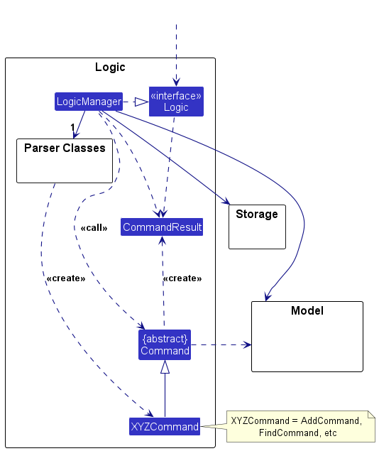
- Omit repetitive details e.g., a class diagram can show only a few representative ones in place of many similar classes (note how the AB3 Logic class diagram shows concrete
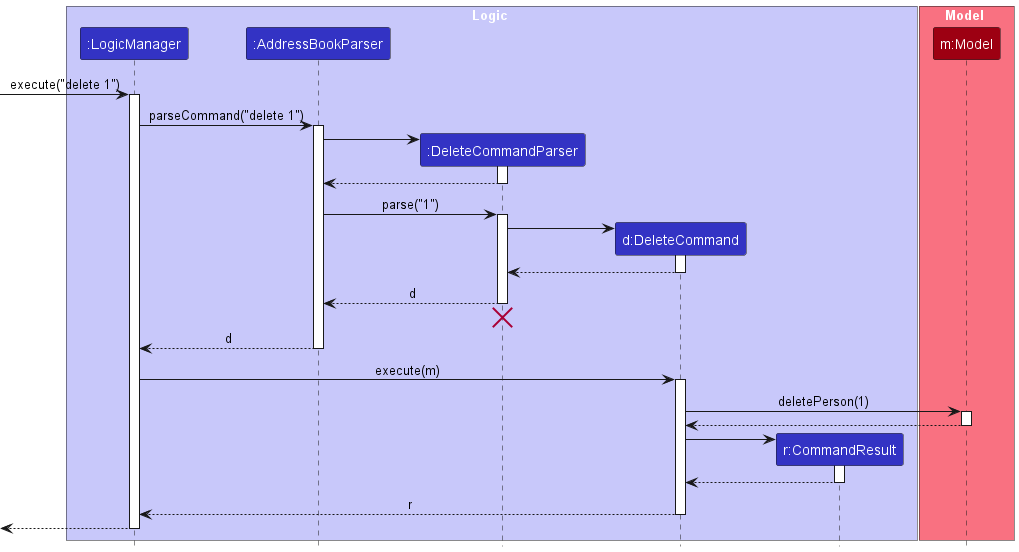
*Commandclasses using a placeholderXYZCommand). - Limit the scope of a diagram. Decide the purpose of the diagram (i.e., what does it help to explain?) and omit details not related to it. In particular, avoid showing lower-level details of multiple components in the same diagram unless strictly necessary e.g., note how the this sequence diagram shows only the detailed interactions within the Logic component i.e., does not show detailed interactions within the model component.
- Break diagrams into smaller fragments when possible.
- If a component has a lot of classes, consider further dividing into sub-components (e.g., a Parser sub-component inside the Logic component). After that, sub-components can be shown as black-boxes in the main diagram and their details can be shown as separate diagrams.
- You can use
refframes to break sequence diagrams to multiple diagrams. Similarly,rakes can be used to divide activity diagrams.
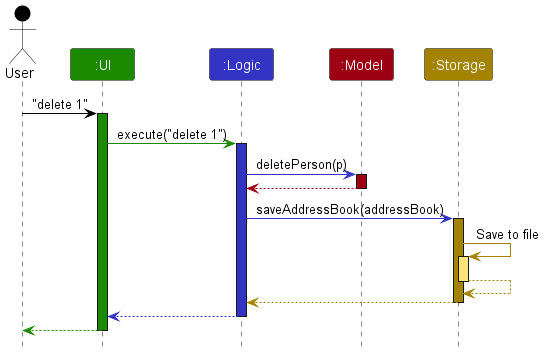
- Stay at the highest level of abstraction possible e.g., note how this sequence diagram shows only the interactions between architectural components, abstracting away the interactions that happen inside each component.
- Use visual representations as much as possible. E.g., show associations and navigabilities using lines and arrows connecting classes, rather than adding a variable in one of the classes.
- For some more examples of what NOT to do, see here.
- Omit less important details. Examples:
- Integrate diagrams into the description. Place the diagram close to where it is being described.
- Use code snippets sparingly. The more you use code snippets in the DG, and longer the code snippet, the higher the risk of it getting outdated quickly. Instead, use code snippets only when necessary and cite only the strictly relevant parts only. You can also use pseudo code instead of actual programming code.
- Resize diagrams so that the text size in the diagram matches the the text size of the main text of the diagram. See example.
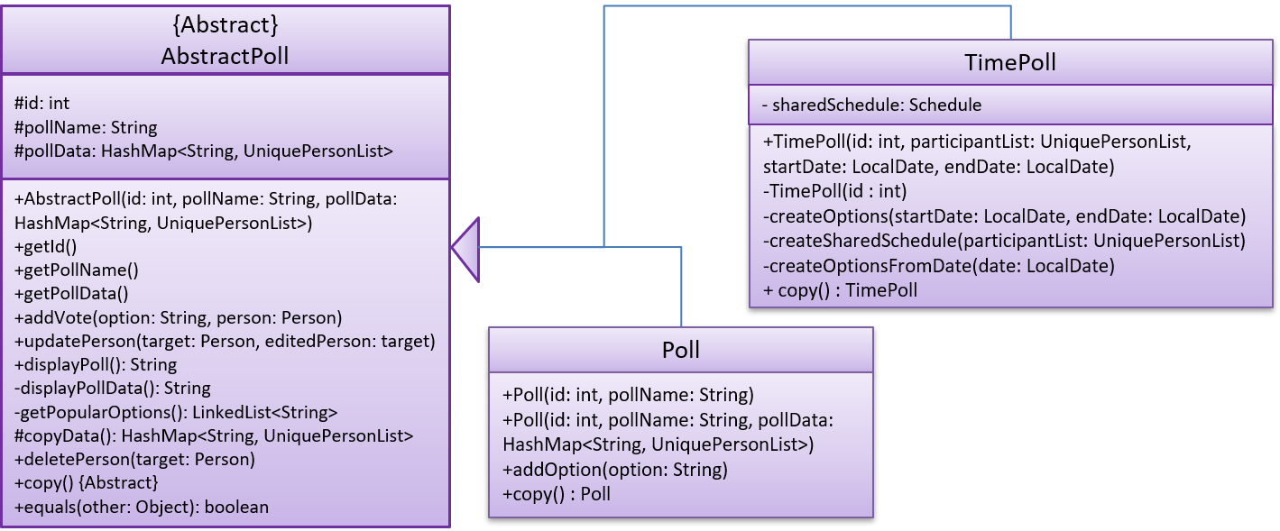
These class diagrams seem to have lot of member details, which can get outdated pretty quickly:
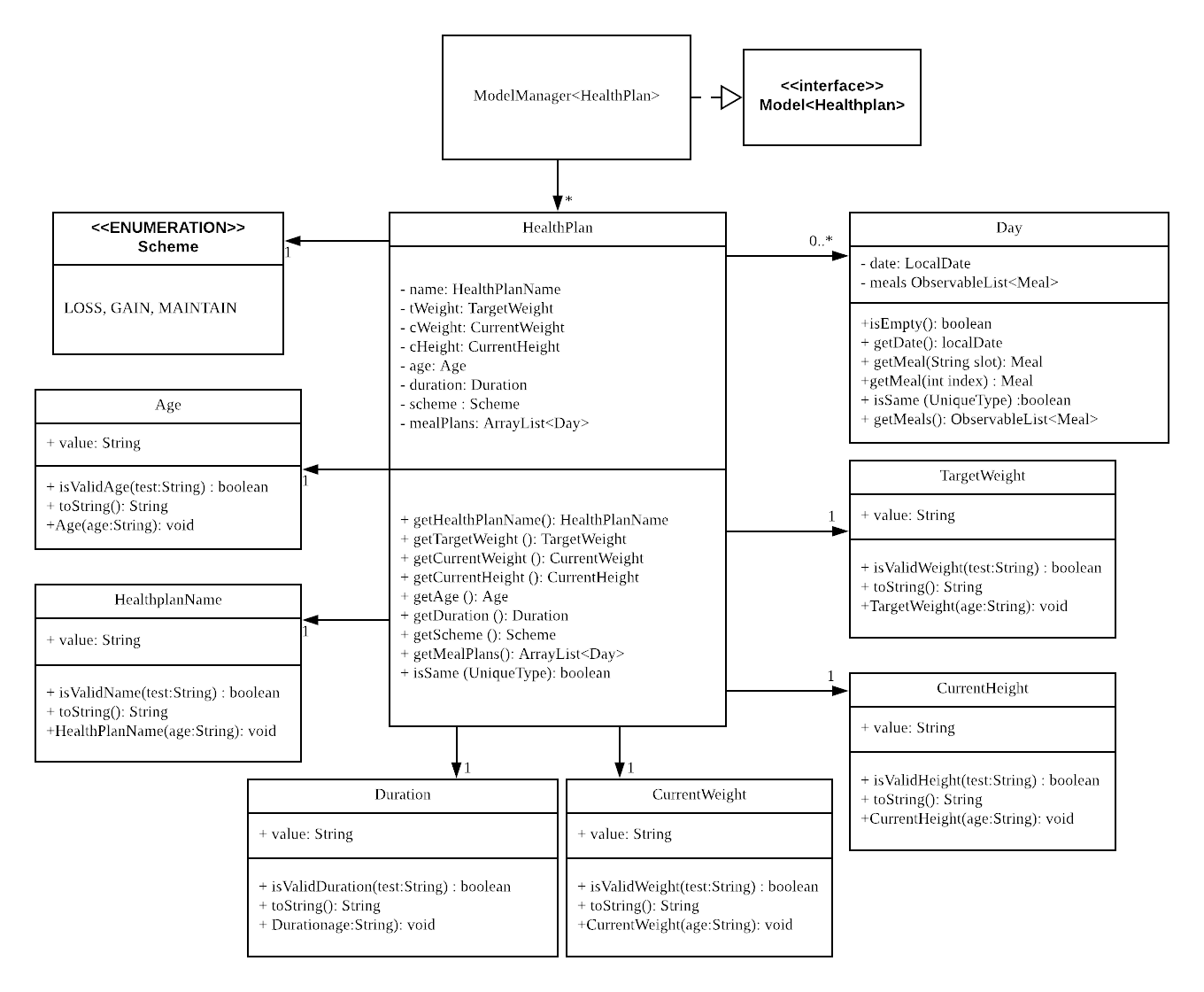
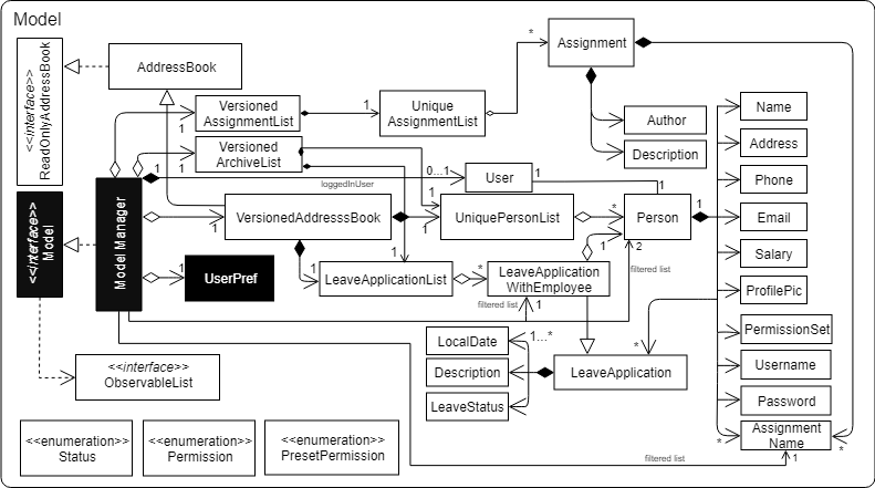
This class diagram seems to have too many classes:
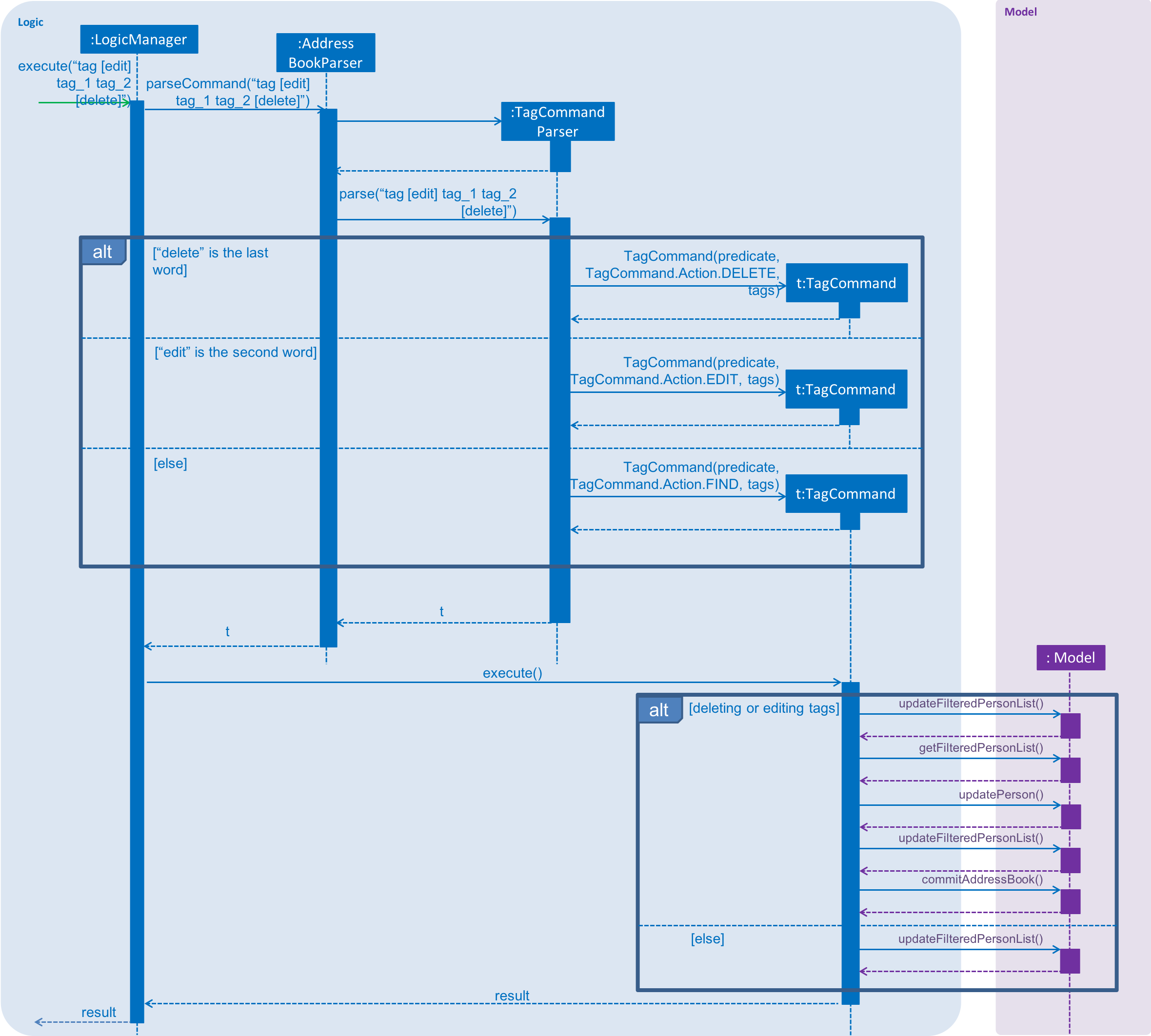
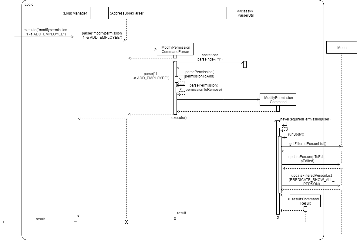
These sequence diagrams are bordering on 'too complicated':
In this negative example, the text size in the diagram is much bigger than the text size used by the document:
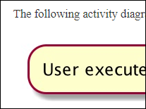
It will look more 'polished' if the two text sizes match.
delete command
